Women of Game of Thrones Personal branding
These were a personal project for me as a way to practice some branding techniques while season 8 was airing. All of the creative choices were made to reflect the character arcs while also working with modern design conventions.
Arya
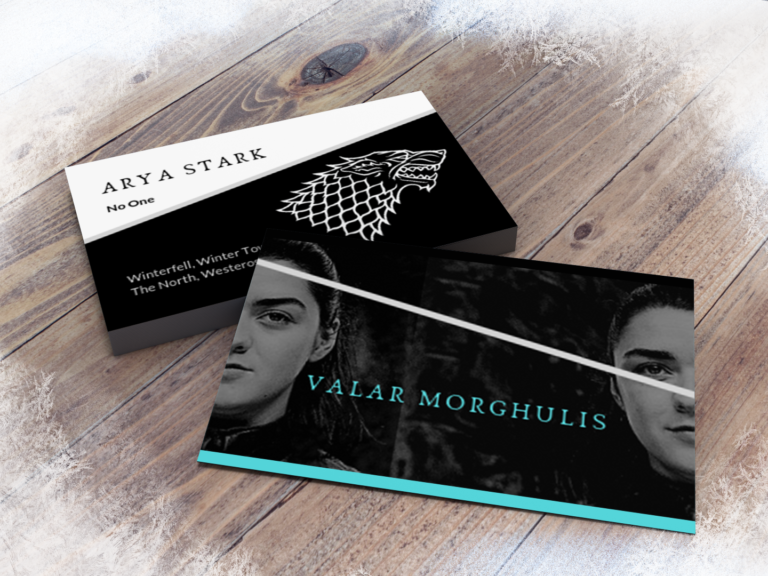
Arya was the first one I did and the one I was most excited about. I have the 2 halves of her face separated to reference her training with the faceless men (and her title being “No One”). There’s an angled slice through the front and back as an homage to the sword, Needle, and it’s off center to be interesting and echo the often unbalanced path of her journey. The ice blue was the last addition; I was working on picking an accent color and then episode 3 happened where she killed *spoilers* and it was perfect.

Margaery
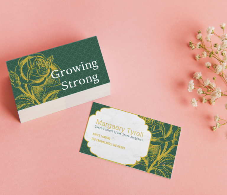
Margaery is a character I’ve always loved (and maybe part of that is just because I love Natalie Dormer). The card relies heavily on her house sidjel of gold roses on a green field. One side of the card is devoted entirely to her words and sidjel, with how much her arc is based around the rise and fall of her family, and half of it is this beautiful blooming rose. Then when you flip the card, the rose illustration pans down to focus on the thorns at the core of her character.
In terms of typography, everything is in serifs except for her name, because Margaery plays into the expectations of the time and place, but she’s a modern woman at her core, willing to manipulate the situation to move her up the throne. Her title as queen is the only text in green and stands out as her highest achievement, having orchestrated marriages to 3 different kings, each more powerful than the last.

Sansa
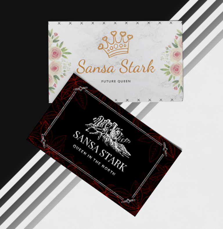
Sansa is my favorite character evolution in the series, so I made a card for season 1 and season 8 because she’s such a different person at each end. At the start of the series, she’s sort of an ivory tower princess type whose ambitions to be queen are based entirely in stories. In the first card she is every bit the naive summer child with all the emphasis on wearing the beautiful crown and being called Queen.
Throughout the series she adapts her style to reflect the most powerful and influential woman, and this card is a lot like the younger sister to Margaery’s, with the florals and the marble background.
By season 8, Sansa has been hardened and grows from the traumas she faced through the series. This new card is serifs for stability and borders for defense. The central iconography isn’t a crown, but the fortress at Winterfell, because her priorities have shifted to maintaining the strength and independence of her kingdom. The silver is regal while also suggestive of steel. Black and gray are her house colors, and where the other card was bright with florals, the only color her is the red leaves of the weirwood, a symbol of the North, and the thing she chose for her coronation gown.


